I am interrupting my party planning to have a quick conversation with you all about spring colours!
You may ask yourself: why the heck is she discussing spring colours on January 10th? Why? Because it is snowing a bit again, I am home with a lot of time on my hands (learning to slow down is going to take some time it appears!) and when I stalked the J Crew website this a.m. looking for that darn pink herringbone blazer (that is a sign right, when I start describing it as that "darn" blazer?) I saw there were some new arrivals (no worries - I am being good as gold!) and those new arrivals gave me a great indication of where J Crew is going with its spring colours...
For me, there are two bellweathers as to the kinds of colours we can expect from JCrew - their no. 2 pencil skirts in cotton and their featherweight cashmere cardigans. In my experience, over the last few years J Crew has had their signature colours in these items in nice solid colours that can then be matched with any of their prints. I revisited last fall's Fasion Week Spring 2013 here, and it is clear that these are our JCrew colours. Mind you - I have not included every colour....
So what did I notice?
Actually what I noticed was that the colours are only changing subtley this spring:
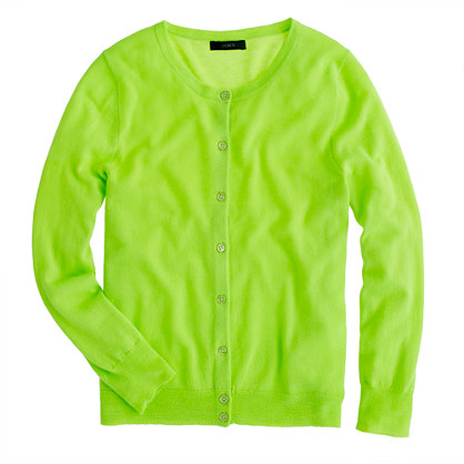
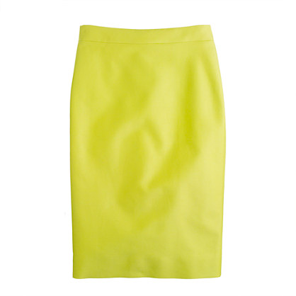
neon lime, the kissing cousin of last year's neon kiwi:
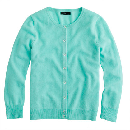
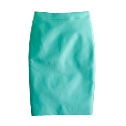
Vivi Aqua - the summer version of retro jade, which never was jade...
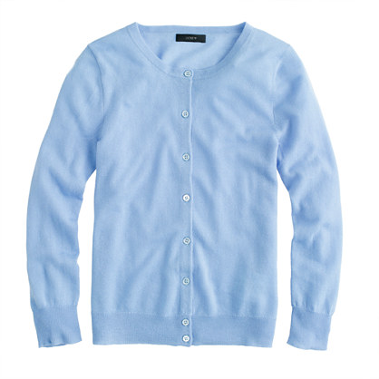
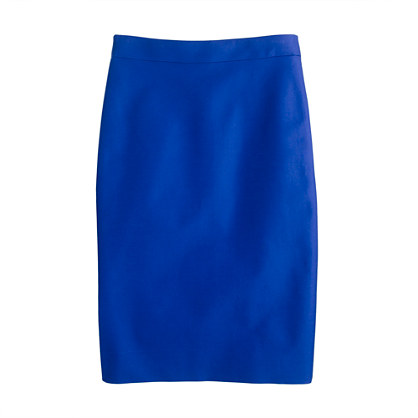
Morning Sky, which appears to me to be last year's orchid blue with a teensy bit more blue:
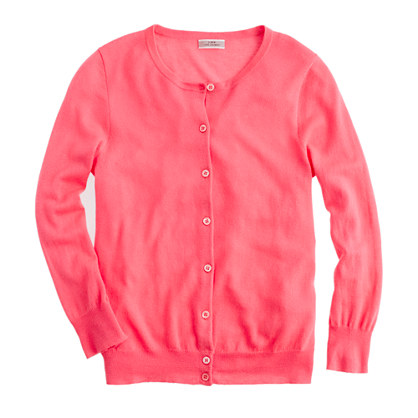
 And neon Rose is hanging around:
 Soft peach,
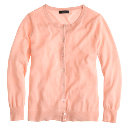
which will be a lovely match with a melon skirt (anyone else getting hungry?)
 Spearmint:
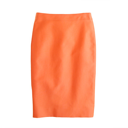
Fresh Pear - I can't recall the name of last year's version of this colour, but I have this skirt!:
 and a lovely Indigo Blue, which looks markedly like Byzantine Blue:
It is clear to me:
1) that if you lke colour, you are still in luck this spring
2) that everything you bought from J Crew last spring and summer will still be okay, because they have only tweaked the colour palette ever so slightly. So slightly, in fact, that I am thinking they may have a bit of trouble selling some of this at full price unless there was a colour someone wanted and missed last summer (i.e. me and Byzantine Blue)
3) that J Crew thinks we don't remember what things were called last summer or what we bought (well the latter is often true for me, so I am not going to belabour THAT point!)
No cotton cafe capris in these colours yet, but you know they are coming. What I am hopeful for is more prints in these colours, so will cross my fingers for one or two special pieces that would go with what I bought last year.
What do you think? Anything inspiring you? Are you getting tired of winter yet? Thank Goodness that I have a party to look forward to! More on that in the next day!
Have a happy Thursday and stay safe out there!
You may ask yourself: why the heck is she discussing spring colours on January 10th? Why? Because it is snowing a bit again, I am home with a lot of time on my hands (learning to slow down is going to take some time it appears!) and when I stalked the J Crew website this a.m. looking for that darn pink herringbone blazer (that is a sign right, when I start describing it as that "darn" blazer?) I saw there were some new arrivals (no worries - I am being good as gold!) and those new arrivals gave me a great indication of where J Crew is going with its spring colours...
For me, there are two bellweathers as to the kinds of colours we can expect from JCrew - their no. 2 pencil skirts in cotton and their featherweight cashmere cardigans. In my experience, over the last few years J Crew has had their signature colours in these items in nice solid colours that can then be matched with any of their prints. I revisited last fall's Fasion Week Spring 2013 here, and it is clear that these are our JCrew colours. Mind you - I have not included every colour....
So what did I notice?
Actually what I noticed was that the colours are only changing subtley this spring:
neon lime, the kissing cousin of last year's neon kiwi:
Vivi Aqua - the summer version of retro jade, which never was jade...
Morning Sky, which appears to me to be last year's orchid blue with a teensy bit more blue:
which will be a lovely match with a melon skirt (anyone else getting hungry?)
Fresh Pear - I can't recall the name of last year's version of this colour, but I have this skirt!:
It is clear to me:
1) that if you lke colour, you are still in luck this spring
2) that everything you bought from J Crew last spring and summer will still be okay, because they have only tweaked the colour palette ever so slightly. So slightly, in fact, that I am thinking they may have a bit of trouble selling some of this at full price unless there was a colour someone wanted and missed last summer (i.e. me and Byzantine Blue)
3) that J Crew thinks we don't remember what things were called last summer or what we bought (well the latter is often true for me, so I am not going to belabour THAT point!)
No cotton cafe capris in these colours yet, but you know they are coming. What I am hopeful for is more prints in these colours, so will cross my fingers for one or two special pieces that would go with what I bought last year.
What do you think? Anything inspiring you? Are you getting tired of winter yet? Thank Goodness that I have a party to look forward to! More on that in the next day!
Have a happy Thursday and stay safe out there!
I LOVE this look!
ReplyDeleteAnd yes: winter. Almost over, but not nearly enough to get excited about, and so we take refuge in the idea of where skirts outdoors. :-)
Greetings from Minneapolis,
Pearl
Hey Pearl - great to hear from you! I love colour. I would love to see some of that dark blue with some of the peachy tones!
DeleteThere's talk of snow next week, my fingers are crossed!
ReplyDeleteI really want some blue this year, none of those shades appeal but hmm the other blue that you have a few things in, I forget its name.
Pagoda Blue or Brocade Blue? Either would look amazing on you! There is a nice cotton vneck in one of those colours on sale right now. I think the aqua colour is supposed to be the summery version. I am hoping for a couple more rich colours - maybe in the jackies?
DeleteI feel like J.Crew has fallen asleep at the wheel.
ReplyDeleteKathy, thanks for getting to my point!
DeleteI feel like that too! Nothing feels different. The colours are all basically the same! I like them, but I am not having a "wow! I really need that" - Where is Marissa?? I want my Marissa!
DeleteSPRING ROLL I'm not much of a pastels girl so the next string roll-outs should be good for my wallet. Do like the idea of a vivid blue pencil skirt though. Laughing about your repeat name and shade comments WMM. To be fair traditional spring clothes/ hues are probably my least favourite season. But, frankly bit bored, wish JC would return to more the the phenomenal prints and singular (non-neon) hues. (I will probably get all excited when more of the sandals pop up though.)
ReplyDeleteHey GF - completely with you! I am so far from sandal weather that I can't even dream? Can someone remind me again why I am going to NYC for March Break and not south? Oh yes - my children... sigh....
DeleteHi WMM,i was just thinking about spring/summr colors too and my local store was full of bright greens,mint,aqua,yellow and pink.
ReplyDeleteI received the boyfriend merino sweater in silver today and i really like that color for spring and i think i will not buy anything bright till i see the sun again(except the neon pink short that was in my order and was really,really cheap).
Hey Ina! I love silver! I need to see that on you! Silver is one of my favourite colours and I have almost nothing silver in my wardrobe...
DeleteOOOOO, I'm loving all of these colors!!!!!!
ReplyDeleteRynetta - are you SURE you are not designing for J Crew - these are all your colours girl? You aren't secretly dating Tom on the side???? :-)
DeleteHah! My thoughts exactly, WMM. Though there is no green, so we may be falling in unfounded accusations against our lovely Rynetta :-)
DeleteI'm not tired of winter yet and I am wishing for some more snow (and a Caribbean vacation lol! I can dream). But I love warm weather and dreaming of spring is fun too. I like all of those colors except for the neon lime. They seem kind of passive, though, other than the saturated Bright Indigo and the bright Neon Lime. I guess this is the pastel trend we have been expecting. I expect this will not be the year that J. Crew makes my weathered red chino shorts !
ReplyDeleteIn general, I like my pastels on easter eggs, though I must say I did love the lavender cardigan I purchased last summer. IN general, the pastels wash me out. I need something that doesn't make me look like I have eaten one too many easter eggs myself!
DeleteIt does seem a bit repetitive doesn't it? I am always drawn to the blues and purples and I did buy them last year so I think I'm set. I prefer the Factory cotton pencils over the Retail ones. The fabric has a bit of texture and is not as stiff and wrinkle-prone. The Factory versions have seaming that is quite flattering on my figure and they also have pockets. It's a totally different skirt really, but I like them much better.
ReplyDeleteHi xoxo - I will have to check out the factory versions - I have never bought one of the skirts, but I would trust your judgement!
DeleteIt seems that J Crew is releasing colors at strange times and missing the mark. Maybe their success is making them lazy: all of the quality and fulfillment issues make me think they appreciate our business less and less. But you know what? I am a glutton for punishment and keep ordering. There, I said it :-)
ReplyDeleteHa! Anthro Blogger - I resemble that remark! I am hoping that there will be a nice emerald green featherweight cashmere! I really like the copper colour - may try that!
DeleteWell, I cannot get excited by new colors in the pencil skirts but I am happy that the neon lime is still around as I have a couple of things from last year that I didn't get to wear much and I was regretting. I would love to get a pair of shoes too in that color. And please white Valentinas!
ReplyDeleteI am like you - I got some of that neon lime, too, but didn;t get much chance to wear it. I think it looks so good with navy, if you are able to pull off the colour! White valentinas! Wowza!
DeleteI'm not ready yet.
ReplyDeleteheehee!
DeleteI love color, so these pieces are right up my alley. Also, I don't shop at J. Crew much (don't know why - just tend to go to Banana Republic more for some reason), so the colors are "new to me." :)
ReplyDeleteHi Merry Wife! I have to go visit the BR website - haven't seen their new updates. I like BR - a much more muted palette than JC, which is not a bad thing, necessarily!
DeleteOh goody. Either colors I can't wear or colors close to things I already have. Now if they would only release all the great prints just in the too-short Jules, I'm in luck for getting my shopping under control. Yippee!
ReplyDeleteIt could just be my own...sensitivities...but isn't it delightfully ironic to be able to purchase a pencil skirt in 'pear'...!?
ReplyDeleteGlad I can still trot out the citron skirt all summer long- but I am now desperately afraid of J Crew neons. They aren't joking!