After all the shenanigans with no power this month and the push to complete the contract that I've been doing, we finally got the dining room painted.
It is always delightful to go in a different direction; it forces you to rethink the placement of art, furniture, and other accessories.
While the room is not technically finished - we will be adding crown molding around the ceiling in the next few weeks, it is basically done and thought you might all like a look!
This time last week, the furniture was huddled together in the center of the dining room.

What a difference in a week makes!
 |
| I think we have determined that we'll paint the chandelier a lovely ivory hue... |
The pale blue, Benjamin Moore's breath of fresh air, has lightened the whole room. So has angling some furniture to get away from the dreaded "lined along the wall look" which I am forced to do in some rooms because of all the doorways, but which I loathe...
Looking in from the living room, you can see we angled the coach and placed the drop -leaf table in back behind. I slip-covered the herringbone tweed coach to lighten it up and added beautiful painterly throw pillows.
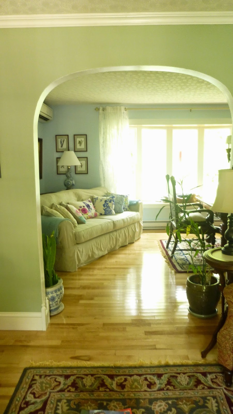 |
| I love the pale green opening on to the pale blue. |
 |
| The pillows were mostly purchased from Chapters and are the bluebellgray collection. They are linen and gorgeous! The pale blue nubby one was bought at Target for $7! |
We also moved the china hutch down to this far end of the room. I like it because now you can see the Wedgwood china, which, along with my mother's portrait, begat the colour scheme.
 |
| The painting is one of a few we have by my artist friend Janice Wright Cheney, who is an award winning artist who shows her pieces everywhere. You can read more about Jan here. I think we bought this painting in 1989. |
 |
| Love the Wedgwood! |
You can see my mother's portrait really pops against the light blue wall:

And exactly opposite the couch, in the far corner, the small liquor cart awaits a visit. I can advise that Barry did visit it last evening...
 |
| Dani - do you recognize that sketch of Chateauneuf de Mazanc above the chair? Wondered if you bought one while there as well! |
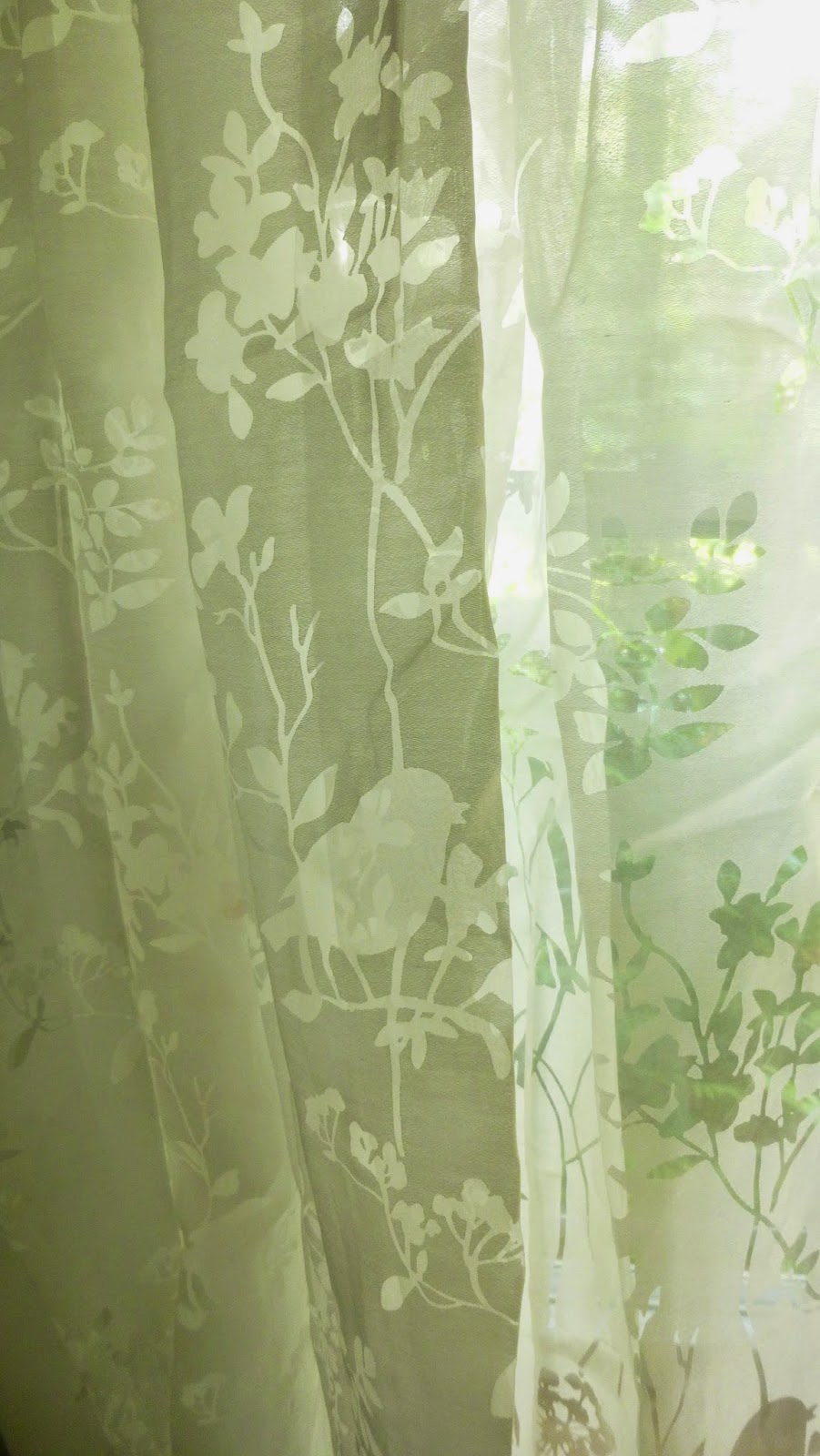
We traded heavy curtains for lovely printed sheers. We don't need curtains for privacy here - our dining room faces trees - but it is nice to have something to pull across when the sun gets hot.
The room feels fresh, and seems to lighten my great-grandparent's heavy oak table and chairs.

All in all, a great success. Nick the Painter can't come back till September, so am kind of hoping that Barry the painter steps in before then, as now the hallway looks dreadful...
Isn't that always the way? You do one space, which pushes you to do another space, and so on and so on....
We are delighting in these pale colours after years of rich, heavy hues. And while I still love those dark colours, I am finding the new schemes very soothing and restful.
Hope you liked the little tour!
Very pretty. I love how the pale walls showcase the more formal furnishings. Thanks for the peek!
ReplyDeleteYou have very beautiful furniture and I really love that portrait, our family house contents all went to the antique dealers alas, I was living between London and America and was in my 'own only what you can fit in a suitcase mode." At 35 I had to furniture shop, we sat on deck chairs for a month and had a kettle, two plates, two mugs and knife and fork to our name- oh a TV of course, saddos like us couldn't live without the box.
ReplyDeleteWell we lived with our bed on milk crates for many years and did the brick/wood plank bookshelves. Most of these things were inherited in the last decade with the death of my Mom and then Dad and of my Aunt. You are missing the couches destroyed by children years....
DeleteWendy,
ReplyDeleteI love your re-do. I love soft tranquil colors. I am stuck with the fruniture against the wall problem, too. Mostly because of doorways and windows. You have such lovely and unusual furniture. IS the chandelier brass? I am developing a renewed appreciation for brass. And, I was buried with deadlines last week, but wanted to comment on your paper dolls post. Oh, I loved them. I can only imagine how excited I would have been to be able to select among all of the ones on the internet today- or to download printable pages. It was such a treat to get a new book. I wonder ( as a boys mother) if little girls still enjoy them?
It is a not brass, but a kind of metal/wood mix. A couple of years ago when we redid our downstairs washroom I used brass taps as I loved how they looked with the black and white toile wallpaper!
DeleteNot sure about the paper dolls nowadays. You don't see many. I am hoping to find a little girl someday that will delight in them!
The new colour is gorgeous! I did not buy a Mazenc sketch and am very much regretting it. I'd love to go back there, the views of the lavender fields from that terrace!!
ReplyDeleteThe angling of the furniture works so well, I find furniture arranging really difficult. Love the slipcovered sofa too, suits the room!
Yes now you'll be on to the next thing, I'm into this reno process big time and once one thing is finished it just makes every other room cry out for help.
Nice bar cart by the way. :)
We love that sketch - it makes us think of sunny days! I want to go back to Nyons and Normandy. I think I could live in Normandy!
DeleteWe go so slow because we mostly do it all ourselves. It takes a lot longer, I can assure you! You can't rush the man! However Barry was so busy this summer, that painting was not in the plans, especially after installing the front door, so Nick the Painter to the rescue!
We know to wait for Barry's excellent results! I love anticipation.
DeleteIt looks fantastic, Wendy!
ReplyDeletethanks Cate!
DeleteIt looks very inviting...your furnishings all work well together in your freshly painted space. I love having family pieces interspersed with our own, it feels like we are keeping the history alive.
ReplyDeletePerhaps Barry the painter will rally at the drinks cart after a day of painting...
I think he would rally, for sure, but I suspect he will wait for Nick to return in September...
DeleteWow it looks sooo good and soo fresh!! Everything is just so inviting and your cushions are fab - you have done a great job!
ReplyDeleteThanks Naomi! That's high praise coming from you!
DeleteExcellent job. I too have the need to "lighten up" and recently kinda sorta did my bedroom. Did not paint the walls but....someday I have to post on the painting fool.
ReplyDeleteTHAT I am dying to read...
DeleteThese are my colors-- the blues and greens--so I am predisposed to this. Really looks restful and inviting. I think it's fun to always have a project to look forward to, as opposed to everything all done. You are creative so suits you to work in a slow manner like this. Very well done!
ReplyDeleteIt is easier to work like this to be sure, but it is also cheaper! ;-) We just can't afford to have people traipsing about here!
DeleteI love the pale blue and the new sheer curtains - it looks very serene! I love blues and greens. We painted one of the bathrooms a pale green/blue/grey (it's an odd colour that changes shade depending on time of day and the light) and it made a huge difference.
ReplyDeleteLouise, we used a paint like that - Benjamin Moore Iced Cube Silver. In one room it looked like a pale lavender, in the bathroom it looked like a watery blue/green.
DeleteI love it when paint is like that - I have grey mist in my office and sometimes it is decidedly blue and other times it is decidedly grey depending on the light.
DeleteHow pretty, I love that interaction between the green and the blue too and with the sheer curtains it all looks so watery and tranquil.
ReplyDeleteThat's a great decision to do the chandelier white, I never would have thought of that but think it will look so elegant!
Jody - I am not a big painter of furniture, probably because my darker pieces are all family pieces and so I am attached to them "as is", but that chandelier screams out for cream or ivory, so I am going to do to the store today!
DeleteHi Wendy, I love the light colours! Everything looks so fresh. We just spent the weekend cleaning our house here and tomorrow we head off to Ottawa. Our new house has those taupey colours - definitely thinking of changing those down the road to light and fresh.
ReplyDeletePatricia - most houses I go into are those taupe-y colours and they can look so elegant. It is interesting that I used variations of the same colours for well over a decade and now have decided I cannot use them anymore. Must be a midlife crisis!
DeleteLooks great! Love the rearrangement...and the cushions!
ReplyDeleteThanks Barb! I am sure you are still missing the coral....
DeleteA complete success! And you'll look gorgeous framed by those lovely colors when you preside á table.
ReplyDeleteFred - it's true! The older I get the more I have to decorate so that I look young and fresh as well. It is very L'estat...
DeleteWhat a beautiful makeover Wendy I love the colours you have chosen, they really en-light the space.The curtains look also very beautiful. I am planning to change my own curtains in the dinning-living rooms. Something which would allow more light through. And those pillows, very pretty as well. Congrats Wendy!
ReplyDeleteIt looks so fresh and pretty Wendy! I love those watercolour like cushions on the sofa, and am laughing at the new need to paint the hallway!! You'll have done the whole house before the end of the year… but freshening things up can be such a great way to reappreciate your old things. xx
ReplyDeleteHeidi - you of all people know the pain of one more room.... hope the garden is coming along!
DeleteI love your mother's china. I inherited from my mother the same china except mine is cream on lavender . Something I shall treasure forever. I love what you've done with your rooms.
ReplyDeleteBonnie
Thanks Bonnie! Your china sounds amazing!
DeleteI would never guessed that pale green would have worked so well. It looks fab! Also loving that chair below the C de M sketch and not just because it's next to the bar cart!
ReplyDeletealso had a dear friend use that shade of green for backsplash tiles in her re-designed kitchen and it also turned out beautifully...that colour has my newfound respect
DeleteThanks! I think the blues and the greens work really well together and the green in the sitting room will be repeated in the hallway. As for the chair - we have 9 of those beasts (they really are beasts!) - they take up a lot of room but the carved tops are exquisite! That is so funny about the backsplash tiles - recently saw some in the store and was in love!!!! Maybe your friend will give us a peek on your blog?
DeleteWendy, I actually asked her that recently and she was quite receptive; however we were feeling especially festive with her deep into the chard and her hubs and I deeper into barrel strength bourbon.
DeleteGet those photos over another bottle...
Deleteloved this tour! love all the changes. i too love the combo of the pale green and blue. so pretty and fresh. well done wendy!
ReplyDeletethanks Janet!
DeleteIt looks gorgeous, I'm not very good at angling furniture, it's a skill I should learn. I love the wall colour and the sheer curtains, it's made such a difference.
ReplyDelete